
Usually, clients bring their own branding and style guidelines with them, which means our job as a web agency is to integrate their existing color palette and brand guidelines into their new website to make an accessible user experience.
Occassionally, I get to be a part of what we did this past week, which is working with a new brand coming up with their color palette from scratch. I thought it would make a good blog post to write it up.
1. Find Inspiration
We wanted to capture community, and a spirit of hospitality, and because of personal experience, this brought us back to a specific place (San Juan, Puerto Rico)…
We did a free image search for photos of San Juan, looking for something we could use for color inspiration, and after some scrolling we found this doorway from a street in Old San Juan, which felt perfect!

2. Extract your Color Codes
I thanked the photographer, downloaded the photo, imported it into Photoshop, and sampled it to get the hexadecimal color codes.

3. Check Contrast Ratios
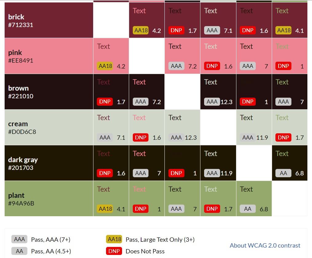
Now that we had a starting point for a color palette, we had to move to the next phase, which is checking for WCAG 2.0 accessibility with our contrast ratios. Basically, we need to have some light colors and some dark colors, and they need a minimum ratio of contrast between them for us to be able to overlay one color’s text on top of another color’s background. This tells us the “rules” we can use for our website to be accessible.
We use several tools for this process, but I want to keep this post simple so I’m sharing only one good one. So we headed on over to the Contrast Grid tool provided by the Eight Shapes design firm, and entered our hex color codes that we got from our inspiration image.
|
Background
Text
|
#712331
|
#EE8491
|
#221010
|
#D0D6C8
|
#201703
|
#94A96B
|
|---|---|---|---|---|---|---|
|
brick
#712331
|
Text
AA18
4.2
|
Text
DNP
1.7
|
Text
AAA
7.1
|
Text
DNP
1.6
|
Text
AA18
4.1
|
|
|
pink
#EE8491
|
Text
AA18
4.2
|
Text
AAA
7.2
|
Text
DNP
1.6
|
Text
AAA
7
|
Text
DNP
1
|
|
|
brown
#221010
|
Text
DNP
1.7
|
Text
AAA
7.2
|
Text
AAA
12.3
|
Text
DNP
1
|
Text
AAA
7
|
|
|
cream
#D0D6C8
|
Text
AAA
7.1
|
Text
DNP
1.6
|
Text
AAA
12.3
|
Text
AAA
11.9
|
Text
DNP
1.7
|
|
|
dark gray
#201703
|
Text
DNP
1.6
|
Text
AAA
7
|
Text
DNP
1
|
Text
AAA
11.9
|
Text
AA
6.8
|
|
|
plant
#94A96B
|
Text
AA18
4.1
|
Text
DNP
1
|
Text
AAA
7
|
Text
DNP
1.7
|
Text
AA
6.8
|
|
|
AAA Pass, AAA (7+)
AA Pass, AA (4.5+)
AA18 Pass, Large Text Only (3+)
DNP Does Not Pass
|
||||||
Look in the contrast grid above, and find where you see AAA because those are the contrast ratios that meet the highest standards (minimum 7:1). This contrast ratio compensates for loss in contrast sensitivity typically experienced by website visitors with visual acuity around 20/80 vision corrected, where 20/20 corrected vision is perfect.
The W3C Working Group chose this cutoff contrast ratio because users with less visual acuity typically will use asssistive devices. In other words, by meeting this standard (7:1 contrast ratio, which is AAA in the grid) we are helping to make a more accessible internet, starting with us. This is important.
As you can see from the contrast grid in our example, we have a lot of good options within our new color palette that meet WCAG 2.0 accessibility standards for minimum contrast ratios. We strongly recommend reading W3C Working Group Note: Understanding SC 1.4.3 Contrast (Minimum) for more relevant details.
4. Build out your Style Guide
Create a page on your website, title it Style Guide, and begin this page with your newly created, accessible color palette! Create your text and background combinations that meet WCAG 2.0 minimum contrast (7:1) standards. This will help you make your asthetic, design-based decisions in your next steps, now that you will have established your accessible color palette with which you can create designs. Congrats!
You won’t use all of these combinations, but I recommend listing them all as options, especially at this early stage. When building out your design, you will make choices from this accessible palette.
Spoiler alert: In this case, we’re building a dark-theme site, so the majority of our text will probably end up being cream text on brown background. But then we’ll use the other things as headlines, and buttons, highlighted text and other visually-separated copy. Taken together, this palette is meaningful and cohesive, because if comes from our inspiration image.
Cream #d0d6c8 text on brick #712331 background
Brick text on cream background
Cream #d0d6c8 text on brown #221010 background
Brown text on cream background
Cream #d0d6c8 text on dark-gray #201703 background
Dark-gray text on cream background
Pink #ee8491 text on brown #221010 background
Brown text on pink background
Pink #ee8491 text on dark-gray #201703 background
Dark-gray text on pink background
Plant #94a96b text on brown #221010 background
Brown text on plant background
Plant #94a96b text on dark-gray #201703 background
Dark-gray text on plant background
5. Have fun designing!
I know this contrast ratio is good. Now I can start designing site elements with our color palette.
And here are a few preliminary background patterns using our new color palette –
6. What if your existing brand colors lack minimum contrast ratios?
You’re gonna need to deal with that. You can work with a 4.5:1 ratio at times, and you can sometimes use an even lower ratio when your text is large. Refer to the WCAG 2.0 guidelines cited elsewhere for details.
But we do have one more tool for you that can help, especially if you are close! If you have a pair of colors that are close to meeting contrast standards, put them into the Accessible Color Generator, by Learn UI Design. This tool can suggest how to change your color just a little bit, enough to meet the minimum contrast standards. It is a good tool to try sometimes.
And if you find that your own brand colors lack minimum contrast ratios, and tweaking them isn’t enough? It is probably time for a rebrand, because your online presence is important and needs to be accessible. If you’d like to discuss this with us, be in touch. We’re always glad to have a chat, even if it is just to hear your ideas and give advice.
Here is the contrast grid for the present site btw…